


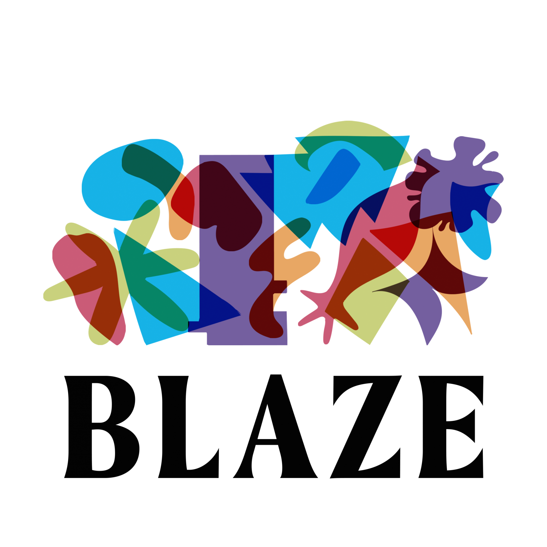


Today we’ve launched our new logo and refreshed brand designed by Millie Davis and a focus group of young people from across Lancashire. We chatted to Millie about her work and the creative process that led to our new look.
First of all, can you tell us a bit about yourself and what inspired you to pursue a career as a designer?
Design is such a vast discipline and it offers the opportunity to bring your interests, values and personality to each and every project. As someone who struggles with dyslexia, design gives me a method of communication that flows naturally. Within my work I utilise my skills to bring light to issues that are important to me – to support local creatives, charities, communities and ethical businesses, as to offer encouragement and assistance in achieving amazing things.
What other projects have you been working on recently?
For the last couple of years I’ve been a part of York Design Week which is a week-long festival that reinforces that idea of design being a vehicle to which you can bring light to important issues. Offering workshops. exhibitions, panel discussions and advice on pursuing careers in the arts, York Design Week has been an incredible way of meeting like-minded people. Through volunteering there, I’ve been collaborating with United by Design, a studio with a similar focus on values-based design. Together we’ve worked on some incredible projects such as; creating beer can designs for BrewYork, promoting community focused, local charities and branding a research project for the University of York.
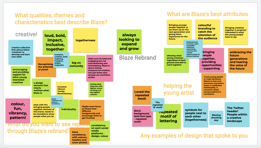
The design brief for the Blaze rebrand was quite unique in that you were asked to work with a focus group to co-design the new brand. How did that work in practice?
Since Blaze is a community of creative, enthusiastic and hard-working young producers, we felt that it was crucial that they were not just at the forefront of the rebrand but also there to experience and guide the whole process. As most projects go, we started with one concept that evolved into the final product. The beginning idea was based around each young producer designing their own letter in order to form a Blaze typeface that the rebrand would revolve around. After running these focus groups, we decided that this font would not be accessible enough for Blaze and thus, the aesthetic of the project changed completely. We were able, however, to transform our original concept into a rebrand that reflects Blaze’s values, services and the young producers that make it all possible. All in all, working with the focus group inspirited every decision the Blaze team and I made and without them, the rebrand would not be what it is, just as Blaze wouldn’t either.
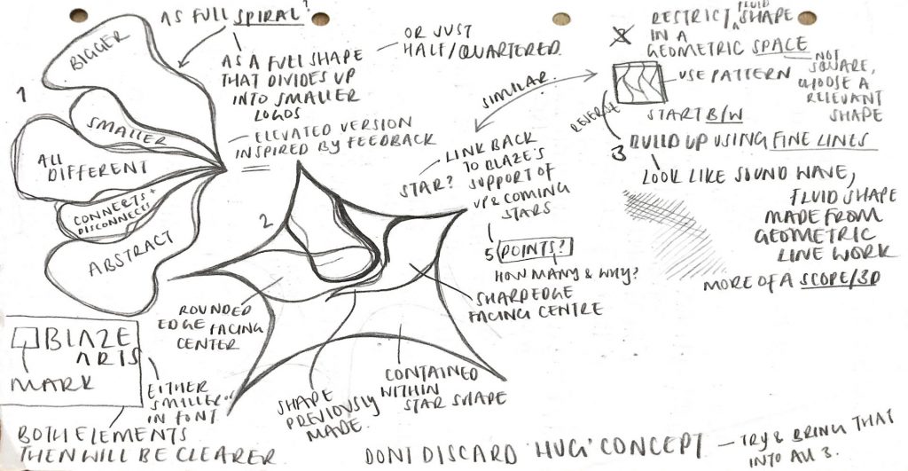
Can you tell us a bit more about the new brand and how it reflects Blaze’s mission and the ideas of the young people you worked with?
Blaze’s new identity mirrors the mission of the charity, wherein young people from all walks of life are brought together to explore their passions and encouraged to pursue their dreams. The rebrand utilises the young producers drawings to shape the refreshed look of Blaze and hopefully encourage some to explore design and potentially seek a career in the arts, with Blaze as a building block. The opinions and creative decisions of the young people involved were essential in the production of the final output and ultimately, it is the young producers who formulated what we see, with a little help from someone who has some experience at tying up the loose ends.
Finally, have you got any advice for young people who are interested in pursuing a career in design?
Design is an art form, just like any other. Don’t be afraid to experiment, play around and most of all, have fun!